vaadin-progress-bar
v1.0.0-alpha2 Vaadin vaadin-progress vaadin-progress-bar web-components web-component polymer


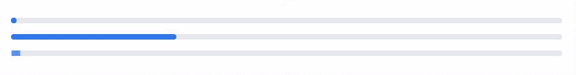
<vaadin-progress-bar>
Live Demo ↗ | API documentation ↗
<vaadin-progress-bar> is a Polymer 2 progress bar, part of the Vaadin Core Elements.
<vaadin-progress-bar></vaadin-progress-bar>
<vaadin-progress-bar value="0.3"></vaadin-progress-bar>
<vaadin-progress-circle></vaadin-progress-circle>
Running demos and tests in browser
Fork the
vaadin-progress-barrepository and clone it locally.Make sure you have npm installed.
When in the
vaadin-progress-bardirectory, runnpm installand thenbower installto install dependencies.Run
polymer serve --open, browser will automatically open the component API documentation.You can also open demo or in-browser tests by adding demo or test to the URL, for example:
- http://127.0.0.1:8080/components/vaadin-progress-bar/demo
- http://127.0.0.1:8080/components/vaadin-progress-bar/test
Running tests from the command line
- When in the
vaadin-progress-bardirectory, runpolymer test
Following the coding style
We are using ESLint for linting JavaScript code. You can check if your code is following our standards by running gulp lint, which will automatically lint all .js files as well as JavaScript snippets inside .html files.
Contributing
- Make sure your code is compliant with our code linters:
gulp lint - Check that tests are passing:
polymer test - Submit a pull request with detailed title and description
- Wait for response from one of Vaadin Elements team members
License
Apache License 2.0
npm i vaadin-progress-bar
Metadata
- Apache-2.0
- Whatever
- Vaadin Ltd
- released 9/20/2017