@solo.gg/react-skeleton
v0.0.5@solo.gg/react-skeleton
⚡⚡⚡ Full fledged flexible skeleton loader for styled-components ⚡⚡⚡
Installation
Add it to your project
npm i -s @solo.gg/react-skeleton
Examples:
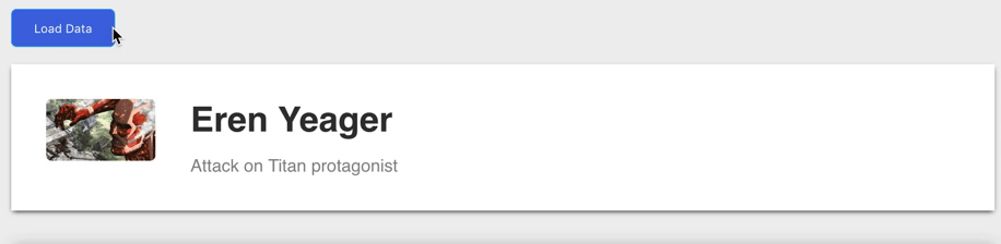
1. Same styles (default) for all elements
// other imports
import skeletonFactory from "@solo.gg/react-skeleton";

// create skeleton
const Skeleton = skeletonFactory();

// wrap your elements using createElement so that
// animation styles are passed in skeleton mode
const Heading = Skeleton.createElement(
  styled.h1`
    color: #333;
    margin: 0 0 1rem;
    grid-area: b;
  `
);
// Base component which will be skeletonized
class Card extends React.Component {
  //...
  render() {
    const { title, description, img } = this.props;
    return (
      <div>
        <Heading>{title}</Heading>
        ...
      </div>
    );
  }
}
// wrap component with createComponent so that
// you can set global default values in skeleton mode
const SkeletonCard = Skeleton.createComponent(
  () => {
    return {
      title: "_____",
      description: "___________",
      img: ""
    };
  },
  ({ title }) => !title
)(Card);
2.Same styles (default) for all elements except Image now has placeholder
// other imports
import skeletonFactory from "@solo.gg/react-skeleton";

const Skeleton = skeletonFactory();

const Heading = Skeleton.createElement(
  styled.h1`
    color: #333;
    margin: 0 0 1rem;
    grid-area: b;
  `
);

// Base component which will be skeletonized
class Card extends React.Component {
  //...
  render() {
    const { title, description, img } = this.props;
    return (
      <div>
        <Heading>{title}</Heading>
        ...
      </div>
    );
  }
}

const SkeletonCard = Skeleton.createComponent(
  () => {
    return {
      title: "_____",
      description: "___________",
      img: "/static/placeholder100x100.png"
    };
  },
  ({ title }) => !title
)(Card);
3.Modified styles (default except different colors) for all elements
// other imports
import skeletonFactory, {
  createSkeletonCSSMixin
} from "@solo.gg/react-skeleton";

const baseColor = "dodgerblue";
const highlightColor = "royalblue";
const animationDuration = 5;

const Skeleton = skeletonFactory(
  createSkeletonCSSMixin(baseColor, highlightColor, animationDuration)
);

const Heading = Skeleton.createElement(
  styled.h1`
    color: #333;
    margin: 0 0 1rem;
    grid-area: b;
  `,
  createSkeletonCSSMixin("dodgerblue", "royalblue", 5)
);

class Card extends React.Component {
  //...
  render() {
    const { title, description, img } = this.props;
    return (
      <div>
        <Heading>{title}</Heading>
        ...
      </div>
    );
  }
}

const SkeletonCard = Skeleton.createComponent(
  () => {
    return {
      title: "_____",
      description: "___________",
      img: "/static/placeholder100x100.png"
    };
  },
  ({ title }) => !title
)(Card);
4.Modified styles for one element (default except different colors) , default for all elements
// other imports
import skeletonFactory, {
  createSkeletonCSSMixin
} from "@solo.gg/react-skeleton";

const baseColor = "dodgerblue";
const highlightColor = "royalblue";
const animationDuration = 5;

const Skeleton = skeletonFactory(
  createSkeletonCSSMixin(baseColor, highlightColor, animationDuration)
);

const Heading = Skeleton.createElement(
  styled.h1`
    color: #333;
    margin: 0 0 1rem;
    grid-area: b;
  `,
  createSkeletonCSSMixin("dodgerblue", "royalblue", 5)
);

class Card extends React.Component {
  //...
  render() {
    const { title, description, img } = this.props;
    return (
      <div>
        <Heading>{title}</Heading>
        ...
      </div>
    );
  }
}

const SkeletonCard = Skeleton.createComponent(
  () => {
    return {
      title: "_____",
      description: "___________",
      img: "/static/placeholder100x100.png"
    };
  },
  ({ title }) => !title
)(Card);
npm i @solo.gg/[email protected]
Metadata
- MIT
- Whatever
- solo.gg
- released 9/19/2018